今天 Bing 差点 被 GFW,纪念一下用必应壁纸做封面吧

翻译整理自:The Complete ggplot2 Tutorial - Part1 | Introduction To ggplot2 (Full R code) 。
r-statistics.co 在我的浏览器书签里应该躺了起码大半年了,特别是其中 ggplot2 的 Top 50 ggplot2 Visualizations - The Master List (With Full R Code) 部分我走马观花翻看过好多回,基本上都是偶尔要用某种稍微复杂点的图需要看看这里面的有没有可以参考的。所以现在打算自己稍微整理一下写出来,一是可以熟悉一下以后自己要用能想得起来到哪儿查,二是学习一下 ggplot2 基础也必不可少,免得每次要用都现查但是查完就忘。前后跨度有点久,所以可能我行文会有点前后差别…
这整个教程分为 3 个大部分:
这里用到的示例数据是 ggplot2 包自带的 midwest 数据,是关于美国中西部部分地区基本人口学的 437 x 28 的 dataframe:
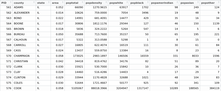
变量太多懒得一一介绍了,基本上就是 ID,地区名,州,面积,总人口,人口密度,各种人种和阶层的人口和比例等一些连续型数据变量,最后是否在地铁区域、类别两个分类变量。
好的,下面开始。
1. 理解 ggplot 的语法
ggplot 与 base R 作图语法差别很大。
首先,ggplot 作图的对象是 dataframe 而不是 vector。比如 base R 画图 plot(x = iris$Sepal.Length, y = iris$Petal.Length),可以看到 x、y 都是通过 $ 取出来的 vector。但 ggplot 和后续的 geom() 需要的都是 dataframe。这个后面再详细谈。
其次,ggplot 通过对 ggplot()构造的图形对象添加图层来逐步增加更多的图形元素。
我们用 midwest 数据来初始化一个 ggplot 图:
1
2
3
4
5
|
library(ggplot2)
data("midwest", package = "ggplot2")

ggplot(midwest, aes(x=area, y=poptotal))
# area and poptotal are columns in 'midwest'
|
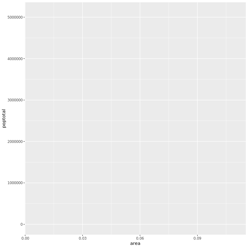
可以看到画出来的是一张空图。虽然 x、y 我们都指定了并且在图中 x、y 轴也都确实有了,但是图里却没有任何点图、条图或者线图之类的。因为 ggplot 其实根本不知道我是想画关于 x 和 y 的什么图!指定图形类型要用 geom_xxx() 。
aes() 用来指定 X 和 Y 轴分别用什么数据,作图用的 dataframe 数据里的信息都要用它来指定。
2. 作个简单的散点图
还用刚刚的数据作个简单的散点图:
1
|
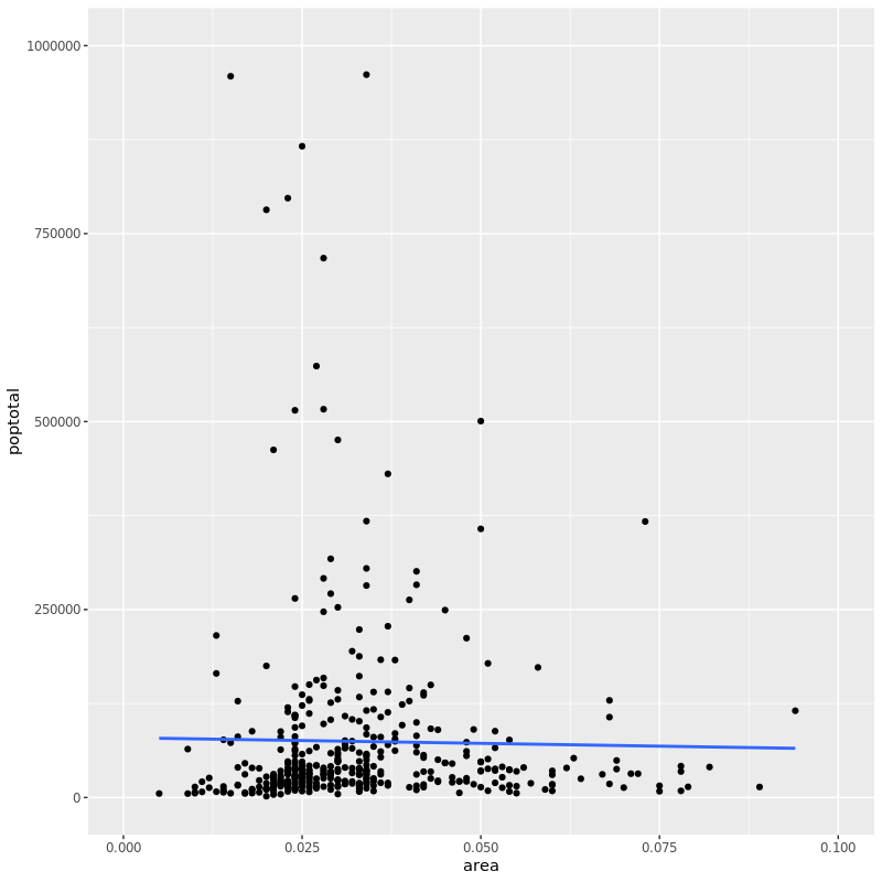
ggplot(midwest, aes(x=area, y=poptotal)) + geom_point()
|
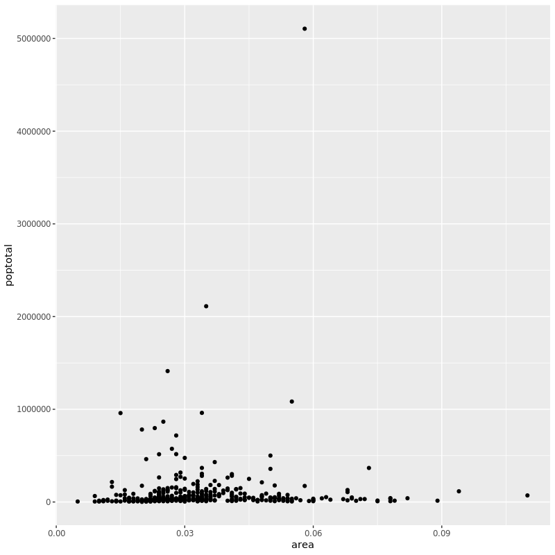
可以看到一旦用 geom_point() 指定了我们想画点图,立马 X/Y 的散点图就作出来了。
但是现在这个图还没有标题,X/Y 轴的标签也不够明确易懂,并且可以看到大部分点都密密麻麻一坨集中在一起。我们后面再看怎么一步步完善这个图。
和 geom_point() 类似的还有很多图层后面将会涉及到。现在我们简单的加一个线性拟合的直线上去:
1
2
3
|
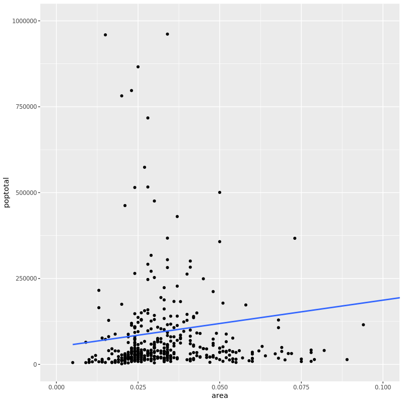
g <- ggplot(midwest, aes(x=area, y=poptotal)) + geom_point() +
    geom_smooth(method="lm", se = FALSE)
plot(g)
|
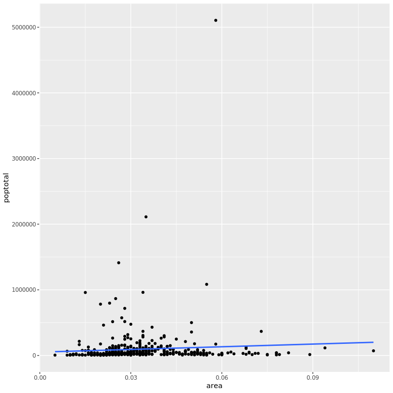
首先这里的代码相比前面我们用了稍稍不一样的语法:先构造一个 ggplot 对象,然后 plot。这在后面图形自定义分面、样式的时候就能显示出优越性了。
geom_smooth()有个 method 参数,默认使用 auto,其他还有 "lm"、 "glm"、 "gam" 和 "loess" ,或者一个自定义函数都行,比如 MASS::rlm 、 mgcv::gam、 base::lm 或 base::loess等等。
下面我们解决刚刚说到的,点过于集中在下面的问题。
3. 调整 X/Y 轴的范围
改变 X/Y 轴有两种办法。
方法 1: 把超出限定范围外的点删掉
由于这个方法直接从原始数据中删掉了超出我们自己定义的做图范围外地点,所以如果再话拟合线的话,新的拟合线会基于新的数据,我们看到的图中的拟合线会发生变化。
1
2
3
|
g <- ggplot(midwest, aes(x=area, y=poptotal)) + geom_point() +
    geom_smooth(method="lm")
g + xlim(c(0, 0.1)) + ylim(c(0, 1000000))
|
相比之前的代码,我们分别加上对 X、Y 轴的范围限定以后,超过范围外的点被删掉。画图的时候 console 命令下提示 warning:
1
2
3
|
Warning messages:
1: Removed 5 rows containing non-finite values (stat_smooth).
2: Removed 5 rows containing missing values (geom_point).
|
而新的图可以看到点聚集在一起的情况有所改善了。这次的语法我们是在之前的 ggplot 对象上直接添加对象,这时候 R 会自动重新做图而不需要我们 plot。仔细看的话还可以看到相比之前的拟合线,现在的拟合线更平(似乎之前斜率为正而现在为负了),这也印证了我们上面说的拟合线会根据新数据重新生成。
方法 2:放大
放大什么意思呢?就是说我们只画出图中我们感兴趣的那一块,其他地方不画,就相当于我们把感兴趣的地方放大了单拎出来看。这个是通过 coord_cartesian() 实现的:
1
2
|
g1 <- g + coord_cartesian(xlim=c(0,0.1), ylim=c(0, 1000000))
plot(g1)
|
可以看到这个方式拟合线还是按照原来的数据画的,所以拟合线的斜率仍然大于 0。
4. 标题和轴标签
添加图标题和轴标签可以用 labs() 的 title 、 x 和 y 参数实现,也可以通过 ggtitle()、xlab() 和 ylab() 实现:
 1
 2
 3
 4
 5
 6
 7
 8
 9
10
11
|
g <- ggplot(midwest, aes(x = area, y = poptotal)) + geom_point() +
    geom_smooth(method = "lm", se = FALSE)
g1 <- g + coord_cartesian(xlim = c(0,0.1), ylim = c(0, 1000000))

g1 + labs(title = "Area Vs Population",
          subtitle = "From midwest dataset",
          y = "Population", x = "Area",
          caption="Midwest Demographics")
g1 + ggtitle("Area Vs Population", subtitle = "From midwest dataset") +
    xlab("Area") +
    ylab("Population")
|
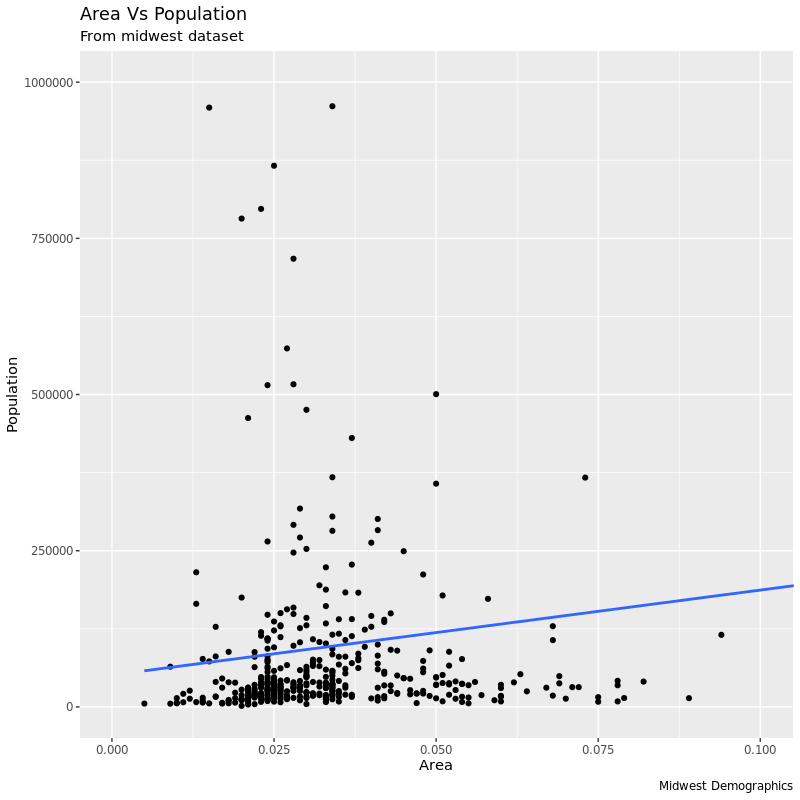
代码中两种方式作的图基本一样,但第二张图少了右下角的 caption。
到目前为止我们的代码完整写一下:
 1
 2
 3
 4
 5
 6
 7
 8
 9
10
|
library(ggplot2)
ggplot(midwest, aes(x = area, y = poptotal)) +
    geom_point() +
    geom_smooth(method = "lm", se = FALSE) +
    coord_cartesian(xlim = c(0, 0.1), ylim = c(0, 1000000)) +
    labs(title = "Area Vs Population",
         subtitle = "From midwest dataset",
         x = "Area",
         y = "Population",
         caption = "Midwest Demographics")
|
5. 改变点的大小和颜色
改变颜色和大小为指定值
这个就很直观了,改变点的大小和颜色、线的颜色只需要分别在对应的 geom_xxx() 里指定就行了:
1
2
3
4
5
6
7
8
9
|
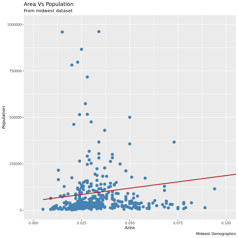
ggplot(midwest, aes(x = area, y = poptotal)) +
    geom_point(col = "steelblue", size = 3) +
    geom_smooth(method = "lm", col = "firebrick") +
    coord_cartesian(xlim = c(0, 0.1), ylim = c(0, 1000000)) +
    labs(title = "Area Vs Population",
        subtitle = "From midwest dataset",
        y = "Population",
        x = "Area",
        caption = "Midwest Demographics")
|
改变颜色为指定分类变量
如果我们想让点的颜色代表 midwest 数据中的某一列,比如不同的州,那就需要用到 aes()了:
 1
 2
 3
 4
 5
 6
 7
 8
 9
10
|
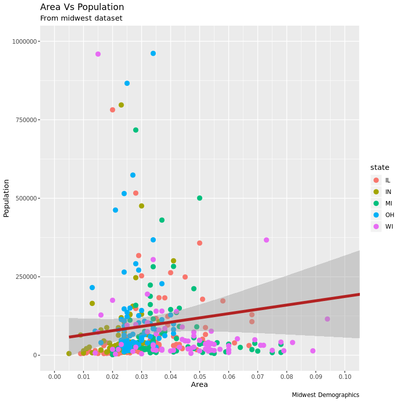
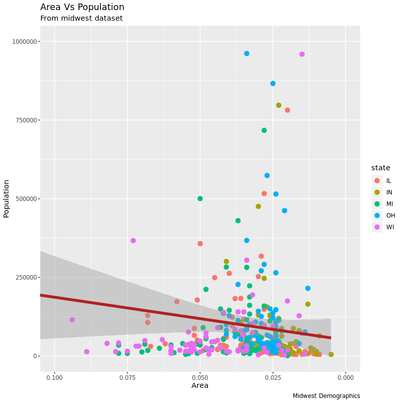
gg <- ggplot(midwest, aes(x = area, y = poptotal)) +
    geom_point(aes(col = state), size = 3) +
    geom_smooth(method = "lm", col = "firebrick", size = 2, se = FALSE) +
    coord_cartesian(xlim = c(0, 0.1), ylim = c(0, 1000000)) +
    labs(title = "Area Vs Population",
        subtitle = "From midwest dataset",
        y = "Population",
        x = "Area",
        caption = "Midwest Demographics")
plot(gg)
|
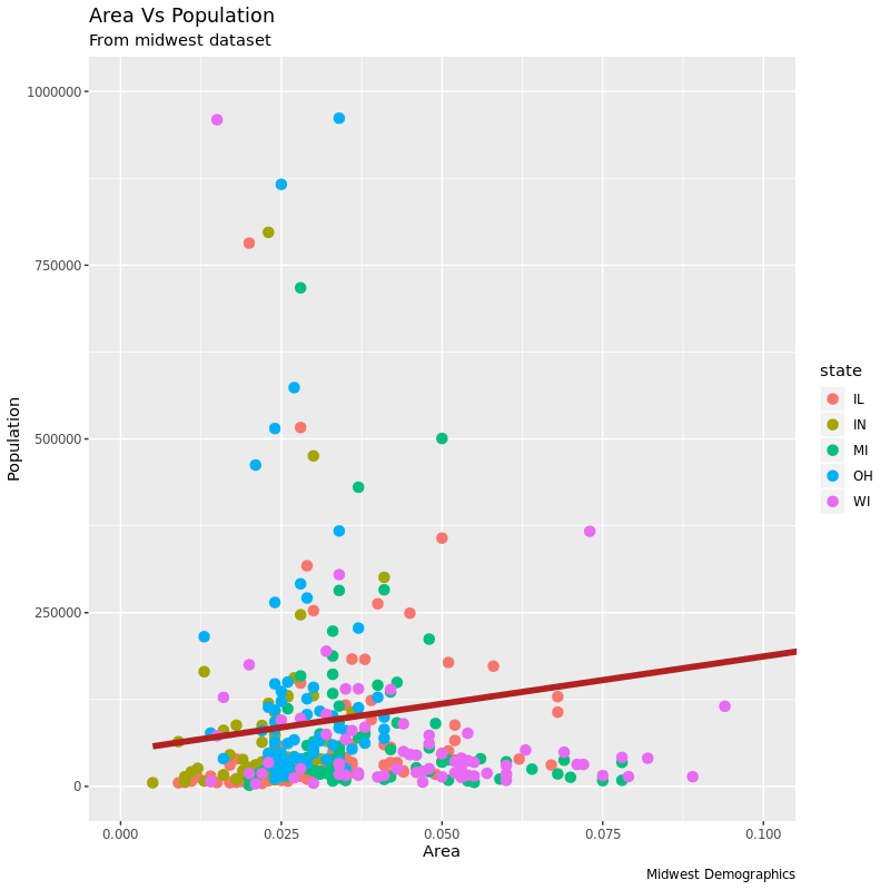
除了点的颜色(color)之外,大小(size)、形状类型(shape)、框线粗细(stroke)和填充颜色(fill)。
在用指定列作为填充颜色时,ggplot 会自己加上图例来说明各种颜色代表什么。要想去掉图例,可以把 theme() 的 legend.position 设置为 None:
1
|
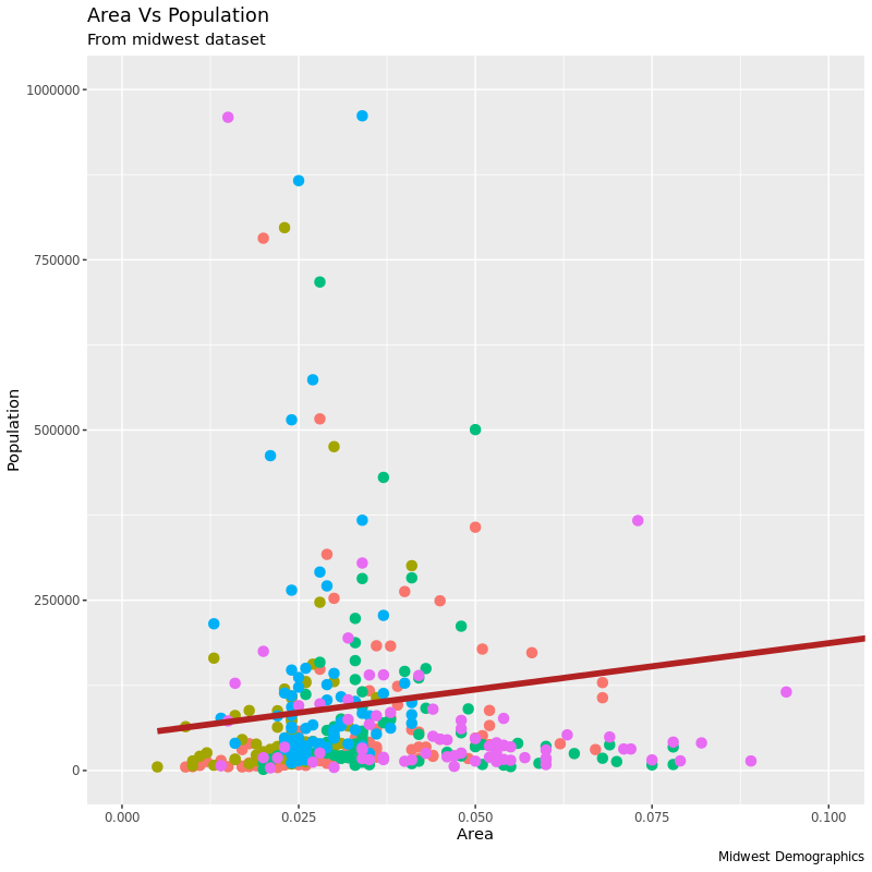
gg + theme(legend.position="None")
|
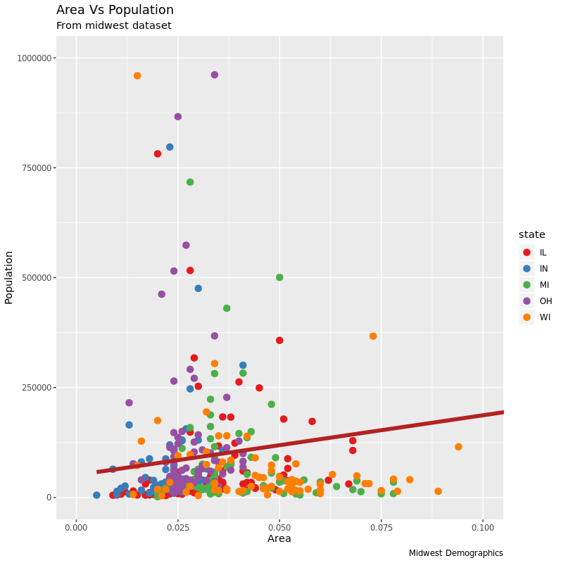
改颜色可以使用 :
1
|
gg + scale_colour_brewer(palette = "Set1")
|
RColorBrewer 包预置了一些很好的颜色组合:
 1
 2
 3
 4
 5
 6
 7
 8
 9
10
11
12
13
14
15
|
library(RColorBrewer)
head(brewer.pal.info, 10)
         maxcolors category colorblind
BrBG            11      div       TRUE
PiYG            11      div       TRUE
PRGn            11      div       TRUE
PuOr            11      div       TRUE
RdBu            11      div       TRUE
RdGy            11      div      FALSE
RdYlBu          11      div       TRUE
RdYlGn          11      div      FALSE
Spectral        11      div      FALSE
Accent           8     qual      FALSE

RColorBrewer::display.brewer.all()
|
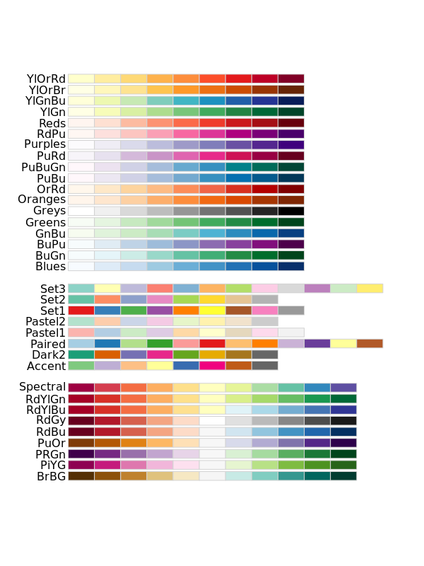
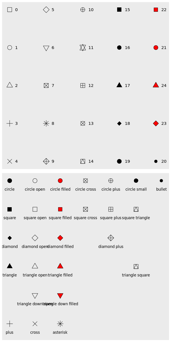
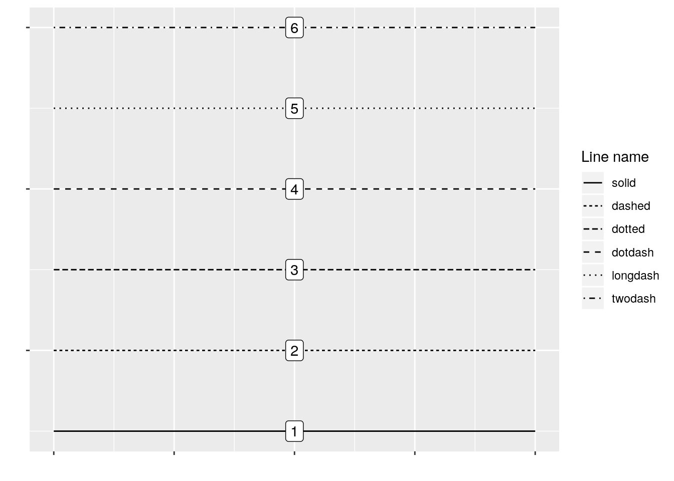
说到改变点、线的形状,这里插播一下 ggplot 里常见的点线类型:
6. 改变 X /Y 轴的刻度和刻度标志
改变坐标轴的刻度及其标志是两部分内容,即 breaks 和 label。
1. 第一步:设置 breaks
设置的 breaks 要和坐标轴轴本来的数据类型一致。比如我们这里因为 X 本身是个连续性数据,所以我们用的是 scale_x_continuous。如果 X 轴是个日期那就要用 scale_x_date。同理,用 scale_y_continuous 就能改 Y 轴。
 1
 2
 3
 4
 5
 6
 7
 8
 9
10
11
|
gg <- ggplot(midwest, aes(x = area, y = poptotal)) +
    geom_point(aes(col = state), size = 3) +  # Set color to vary based on state categories.
    geom_smooth(method = "lm", col = "firebrick", size = 2) +
    coord_cartesian(xlim = c(0, 0.1), ylim = c(0, 1000000)) +
    labs(title = "Area Vs Population",
        subtitle = "From midwest dataset",
        y = "Population",
        x = "Area",
        caption = "Midwest Demographics")

gg + scale_x_continuous(breaks = seq(0, 0.1, 0.01))
|
2. 第二步:改 labels
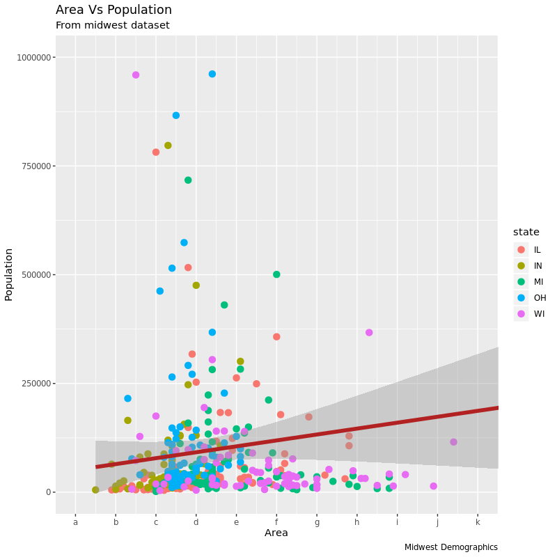
改完刻度我们也可以改刻度的标签,我们需要通过一个和 breaks 一样长度的 vector 传递给 labels 参数。比如这里 X 轴一共 11 个刻度,我们用 11 个字母 a~k 来作为标签替代原来的数字:
 1
 2
 3
 4
 5
 6
 7
 8
 9
10
11
|
gg <- ggplot(midwest, aes(x = area, y = poptotal)) +
        geom_point(aes(col = state), size = 3) +  # Set color to vary based on state categories.
        geom_smooth(method = "lm", col = "firebrick", size = 2) +
        coord_cartesian(xlim = c(0, 0.1), ylim = c(0, 1000000)) +
        labs(title = "Area Vs Population",
            subtitle = "From midwest dataset",
            y = "Population",
            x = "Area",
            caption = "Midwest Demographics")

gg + scale_x_continuous(breaks = seq(0, 0.1, 0.01), labels = letters[1:11])
|
我们还可以通过 scale_x_reverse() 把 X 轴从大到小反着画:
 1
 2
 3
 4
 5
 6
 7
 8
 9
10
11
|
gg <- ggplot(midwest, aes(x = area, y = poptotal)) +
        geom_point(aes(col = state), size = 3) +  # Set color to vary based on state categories.
        geom_smooth(method = "lm", col = "firebrick", size = 2) +
        coord_cartesian(xlim = c(0, 0.1), ylim = c(0, 1000000)) +
        labs(title = "Area Vs Population",
            subtitle = "From midwest dataset",
            y = "Population",
            x = "Area",
            caption = "Midwest Demographics")

    ))
|
通过格式化转化原本的坐标刻度生成新的自定义刻度标志
这个看起来有点不知道说什么,通过下面的例子说明就很好懂了。
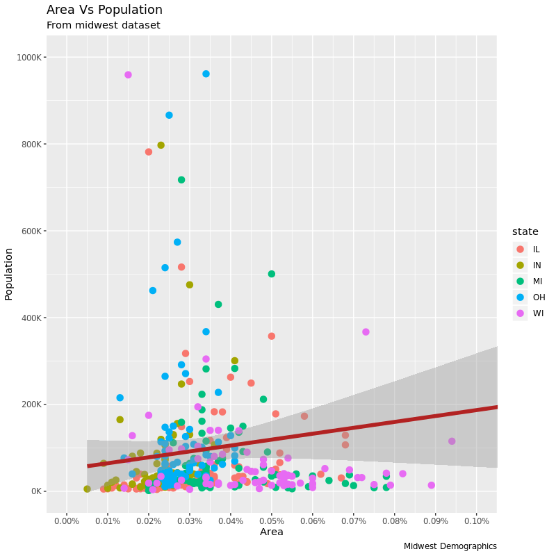
现在的 Y 轴都是很大的数字,如果我想改成类似于 1K、10K 这样的的表示,该怎么做呢?有两种办法:1. 用 springtf() 来格式化输出为我们想要的;2. 用自定义函数实现转换。下面的例子分别把 X、Y 轴用两种方法转换标志:
 1
 2
 3
 4
 5
 6
 7
 8
 9
10
11
12
13
14
|
gg <- ggplot(midwest, aes(x = area, y = poptotal)) +
    geom_point(aes(col = state), size = 3) +
    geom_smooth(method = "lm", col = "firebrick", size = 2) +
    coord_cartesian(xlim = c(0, 0.1), ylim = c(0, 1000000)) +
    labs(title = "Area Vs Population",
        subtitle = "From midwest dataset",
        y = "Population",
        x = "Area",
        caption = "Midwest Demographics")

gg + scale_x_continuous(breaks = seq(0, 0.1, 0.01),
                        labels = sprintf("%1.2f%%", seq(0, 0.1, 0.01)))+
    scale_y_continuous(breaks = seq(0, 1000000, 200000),
                       labels = function(x) {paste0(x / 1000, 'K')})
|
用已有的主题一次性改变整个图的样式
在第二部分我们会继续学如何改变 ggplot 的各个部分,但同时,我们还可以用已有主题直接一次性改变整个图的样式。?theme_bw() 帮助里能看到自带的主题。
要应用 ggplot 主题也有两种方式,一种是在作图前用 theme_set() 设置作图主题,这一设置会影响之后的作图;另一种办法是在图的时候添加主题设置(比如 + theme_bw()这样)。
我们这里看一下通过第二种办法设置两种不同的主题后产生的两张图的效果:
 1
 2
 3
 4
 5
 6
 7
 8
 9
10
11
12
13
|
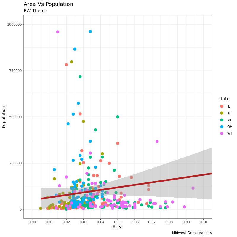
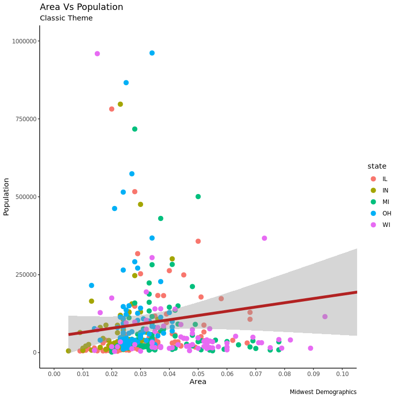
gg <- ggplot(midwest, aes(x = area, y = poptotal)) +
    geom_point(aes(col = state), size = 3) +
    geom_smooth(method = "lm", col = "firebrick", size = 2) +
    coord_cartesian(xlim = c(0, 0.1), ylim = c(0, 1000000)) +
    labs(title = "Area Vs Population",
        subtitle = "From midwest dataset",
        y = "Population",
        x = "Area",
        caption = "Midwest Demographics") +
    scale_x_continuous(breaks = seq(0, 0.1, 0.01))

gg + theme_bw() + labs(subtitle = "BW Theme")
gg + theme_classic() + labs(subtitle="Classic Theme")
|
BW 主题效果:
以及 Classic 主题的效果:
如果想要更多的主题可以看看 ggthemes 和 ggthemr 这两个包。
到这里第一篇就结束了。下一篇会讲到一些进阶的自定义主题、图例、注释、分面和样式等等内容。
code: ggplot2_1.R